

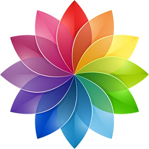
Imagine you are walking down a street and you see two women. One is wearing a brown dress and the other a bright red dress. Which one do you notice? The one in the bright red dress of course! That's how colour affects us.
• |
Red indicates danger. It stimulates the mind and raises blood pressure. Las Vegas is the city of red neon lights as it makes people gamble and take risks under the red lights. People working in a red environment work faster but they make more mistakes. |
• |
Blue is associated with peace and relaxation. Blues complement cool and pastel colours |
• |
Black is considered a heavy and depressing colour. Use of black as the dominant colour should be carefully considered. |
• |
Brown conveys stability, simplicity, and comfort. It can be considered a drab colour as well. |
• |
Green is easy on the eye; it has a calming effect. It is popular in hospitals |
• |
Gray is a very conservative colour and conveys practicality, reliability and responsibility. |
• |
Pink is considered a feminine colour. |
• |
Purple conveys spirituality, royalty and mystery. |
• |
Orange is a warm colour. Used in small amounts, it can make a site interesting and fun. |
• |
Yellow is an eye-catching and cheerful colour. |
• |
White is the colour of purity and cleanliness. |
Visitors to your website form their first impression about your website within the few seconds. The right use of colour can make a visitor feel welcome, relaxed and comfortable - just like an inviting comfortable home! Don't let your website get lost in a maze of million Websites. Use colours effectively to draw your customers in and entice them to buy your product or service.
Contact us to find out how to use the right colours for your website.
Copyright 2004-2020 InterDream Designs - Toronto Web Design. All Rights Reserved
Privacy Policy
| Sitemap